Reimagining medication adherence technology
CueMed
Project planning | Workshop facilitation | User research | Market research | Concept testing
Role: UX designer & project manager
Team: 1 project manager, 1 researcher, 2 designers
Duration: 2 months
Tools: Sketch, Omnigraffle, Google Forms, Google Sheets
Platform: Mobile app
Project overview
Among patients with chronic illness, approximately 50% do not take medications as prescribed. This poor adherence to medication leads to increased morbidity and death and is estimated to incur costs of approximately $100 billion per year.
CueMed is a digital health start up looking to help people manage & organize their medications and improve health by combining the power of technology with the empathy of real life coaches. CueMed uses software and hardware components to help users with medication adherence. I collaborated with two other collegues to conduct software and hardware concept testing for CueMed.
Challenge
People with chronic conditions often struggle with:
Effectively managing and organizing their medications
Remembering to take medications while traveling
Developing a medication routine
Solution
CueMed empowers users to effortlessly:
Track and organize their medication
Add medication information and reminders
Use a simple mobile application with an integrated hardware component
My role & contributions
My roles were Project Manager and UX Designer during this 3-week client project. I worked with and supported one Interaction Designer and one UX Researcher as well.
I was in charge of project planning/management, client management, prioritization of tasks/time, visioning workshop facilitation, and Statement of Work.
I conducted a visual comparative analysis, created visual design artifacts, and led the client presentation.
I also assisted in hardware and software concept testing.
Determine project scope
We needed to learn about CueMed and understand how we could deliver optimal value to the business and its customers, given our three week timeline.. To accomplish this, I led the client kickoff meeting, defined the project scope, and created the Statement of Work.
Statement of Work
Our client initially wanted us to conduct usability testing on hardware and software prototypes. However, upon closer examination, we determined that CueMed's prototypes were not in a state to allow usability testing. In addition, the prototypes were not designed or built with a target user type and specific user needs in mind.
We needed to take a step back with the product and help CueMed lay a user-centered foundation as well as develop a business vision for CueMed moving forward.
With the goal of providing as much value to our client as possible, we defined the scope of our project as follows:
Determine target user type
Develop a shared vision for CueMed
Ideate designs based on user research
Conduct concept testing on software and hardware
Iterate designs based on user feedback
Project planning
I spearheaded the client kickoff meeting and project planning. I led the creation of a Statement of Work for the client outlining the scope, timeline, and deliverables for the project. The deliverables included:
Vision Statement
Competitive Analysis
Visual Comparative Analysis
Personas
User Flows
Test Report Summary
I then created a project plan and tracked our workflow using a kanban board to support a lean framework.


What is CueMed?
I led project planning, conducted a visual comparative analysis, and I facilitated a visioning workshop with the client to help them define what CueMed is and to get the team and stakeholders on the same page.
Visioning workshop
We wanted to help CueMed develop their own voice and tone through creating a shared vision.
I facilitated a visioning workshop along with the client and the rest of the team. Thinking as a user of the product, like Nadia, we all had to think of key qualities that matter most, categorize and prioritize them.
This helped the client develop a vision for CueMed based on their target users and also allowed us to be on the same page as the client.

We defined the most important qualities of CueMed:
Effective
Easy to use
Secure
Supportive
Engaging
We developed a tentative Vision Statement:
““CueMed understands customers and we support and empower them to achieve their goals in an easy and accessible way.””
Visual comparative analysis
We wanted to look at competing company’s voice and tone, so I created a visual comparative analysis with seven competitors.
Some key findings showed that scientific and educational tone was used if geared toward healthcare professionals and a more personable and friendly tone if geared toward end users, such as patients. All color schemes included some hue of blue and/or green.
Understand and define primary users
After we defined what CueMed was and what they represented, we worked with our client to understand who their target users were. We leveraged existing research to help us define and build a primary persona to reference as we recruited participants for research and started thinking about design concepts.
Existing research
The client had worked with a researcher before coming to us with this project. The previous researcher had collected a large breadth of data on users' medication routine and adherence. Our researcher used this data in combination with our client's request to focus on users with hypertension and diabetes to determine our target user type.
35-65 years old
Must have a chronic condition (HBP preferred; diabetes secondary)
Take 3-5 medications daily
Persona development
Once we had determined our target user type, our researcher synthesized that information and created a primary persona. She represented CueMed's primary user and we used her needs and pain points to inform our design decisions moving forward.
Needs & goals:
To manage her diabetes and hypertension
Improve medication regimen adherence
Find more time for yoga and meditation
Frustrations:
Interruptions in her daily routine
Forgetting to take daily medications
Remembering when to refill medications
Remembering which medications to take with food and without food
Not keeping a regular workout routine
Created by Researcher
Ideate designs
Using the user research and Nadia’s persona, our interaction designer created user flows and I created user stories of specific tasks Nadia would carry out while using CueMed’s product. These flows included:
adding a medication
interacting with the software through medication reminders
interacting with the hardware at home.
Because current software designs were already in production but not ready for usability testing, we decided to focus on user flows and screen design for adding a medication and syncing with the hardware system.
Design studio
Using the user flow, we then moved forward with sketching out screen ideas. We did a design studio, where we gathered the entire team and rapidly sketched our different ideas for CueMed’s product. In this design studio, we primarily focused on sketching out screens for the “adding medication” task.
Wireframe flow
Our interaction designer took the screen sketches, expanded on them, and created digital wireframes to use in our concept testing. We used these digital wireframes to construct a concept test with participants.


Created by Interaction Designer
Concept test overview
Part 1: User interviews
Elucidate behaviors, needs, and goals of participants by asking about medications, routines, and tools/strategies they use to organize and manage their medications.
Part 2: Software screen flow
Show participants “Add Medication” screen flow, does it make sense, why or why not?
Part 3: Hardware feature validation
Explore hardware feature validation, ask participants which feature would work best and why?
Part 1: User interviews
To begin the concept testing, we asked broad, open-ended questions to elucidate the following qualitative data:
Conditions, medications, routine
Tools to manage medication organization & adherence
Pain points/needs regarding medication
Key findings
Our findings revealed that since our participants have chronic conditions, they have been forced over the years to develop strategies for organizing and managing their medications. Interestingly, their method for organizing their medications, was also their mechanism for remembering to take their medication.
These methods included original bottles being visible, weekly organizers, and some participants carried around pill pouches/keychains. These strategies worked fine until certain pain points (see below) arose.
Even though these participants had developed systems for medication adherence, they all were interested in a tool that would help them with medication organization and management.
Some pain points and user needs for CueMed to address in future product redesigns include:
Routine disruption
Changing time zones
Mobility/travel
Unsure if they took meds already
Part 2: Software screen flow
For the second part of the test, we wanted to show the participants the screen layout and flow for adding a medication to the software. We then asked them whether this made sense to them, why or why not. Their feedback gave us the basis for some design iterations. Our interaction designer, Christine, took participant feedback and iterated on the screen designs.
Key findings
Problem #1:
Users were confused by the "Medication Schedule" screens. They were unsure if "Times of Day" meant times per day or the quantity of pills for each medication.
Problem #2:
Surprisingly to us, users wanted to input all relevant medication information on one screen, as opposed to a step by step process.
Solution #1:
We resolved this by removing the quantity aspect and allowing users to add dosing times as needed by pressing the purple "+" button.
Solution #2:
We combined all the steps into one long, scrolling form based on user feedback.
Initial designs
Iterated designs


Created by Interaction Designer
Part 3: Hardware feature validation
Per our client's request and to inform hardware design moving forward, we conducted feature validation for the hardware component design. I created hardware prototype designs in Illustrator to validate features with participants. These features included:
Pill Organization
Measuring Adherence
Hardware Configuration
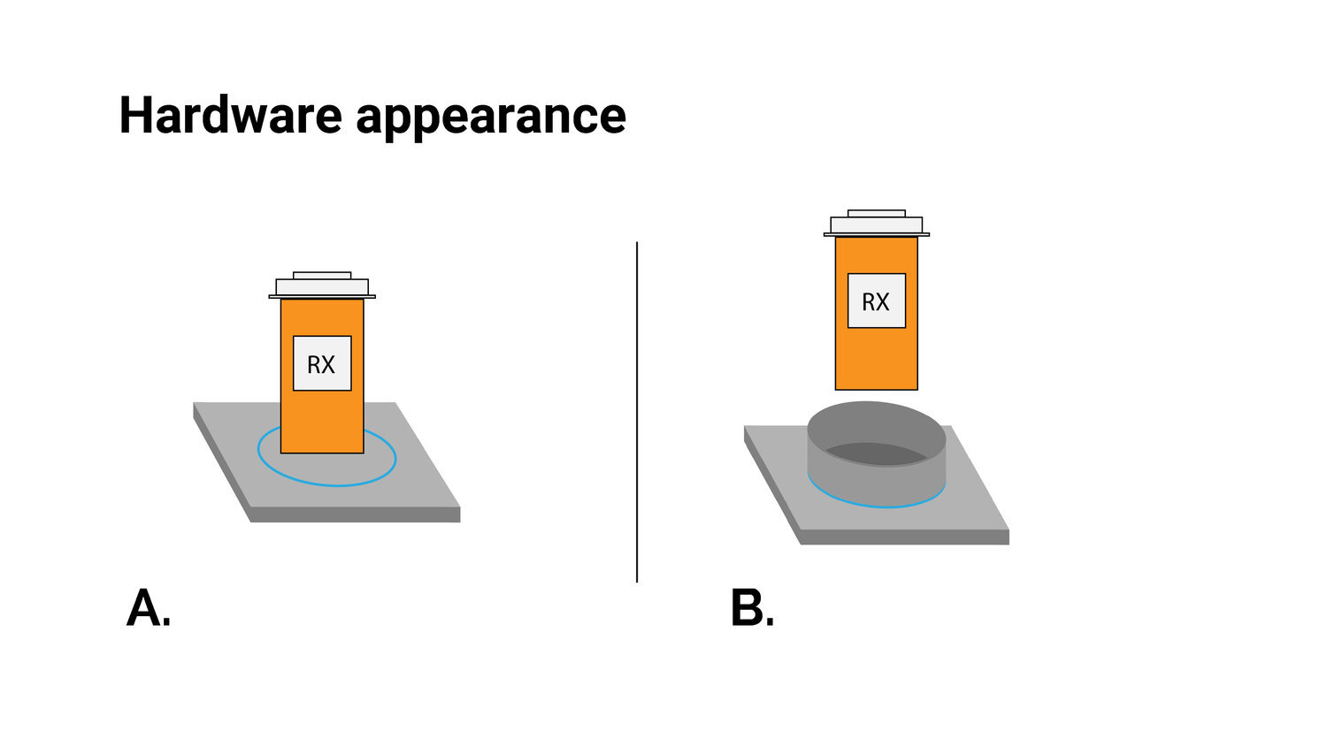
Hardware Appearance
Key findings
Pill organization: Most participants preferred pill organizers over original pill bottles because with a pill organizer they can refill it once a week/month and not have to remember which pill to take when.
Measuring adherence: 5 out of 6 preferred the RFID sticker option over the weight sensor option. Users worried that weight sensors might not be precise enough to measure small changes in weight.
Hardware configuration: Half preferred modularity and the other half preferred 7-day pill organizers on hardware.
Hardware appearance: If using the original pill bottle, all users preferred the walled for stability.


Considerations
Consider designing a modular pill organizer
Consider incorporating RFID technology or an alternate method that’s more reliable
Consider portability as a feature
Potential hardware redesigns
We took our hardware test findings and I created potential hardware designs that addressed Nadia’s needs: portability, weekly pill organizer (as opposed to original bottle), reminder feature (LED lights & module is empty, rather than counting pills from original bottle). We gave these redesign ideas to our client for future design direction.

Key takeaways
Findings
Users have their own system for organizing and remember medications and that system of organizing is often their only system for remembering.
Users experience a variety of pain points regarding medication adherence. These include: routine disruptions, simply forgetting, mobility, and traveling across time zones.
User interviews revealed interest in tracking ancillary health aspects: food intake, physical activity, nutritional counseling, video conferencing with physician, patient education, support system, general wellbeing.
Recommendations
Consider portability, daily organization, and reminder features for potential product redesigns
Use concept test findings to inform current prototype redesigns (hardware & software)
Test redesigned product prototypes through usability testing
Continue exploring pairing technology with social intervention
Next steps
Short-term
Consider portability, daily organization, and reminder features for potential product redesigns.
Use concept test findings to inform current prototype redesigns (hardware & software).
Test redesigned product prototypes through usability testing.
Determine Metrics of Success such as Beta-tester onboarding and app referrals.
Long-term
Consider new secondary research around smart bottle technology and adherence.
Continue exploring new technology such as pairing technology with social intervention and augmenting objects in daily routine with visual reminders.
Continue exploring holistic healthcare aspects as a solution. Food intake, physical activity, nutritional counseling, video conferencing with physician, patient education, support system.
Reflection
My team was great at communicating and doing whatever it took to get things done. As project manager, I felt as though I successfully planned and managed to produce valuable insight for our client. Even though we were very unsure of our focus in the beginning of the project, I think we were able to adapt and complete a successful project through effective communication and collaboration.
Working with clients can be challenging. They often know they want to implement UX design into their product but they aren’t exactly sure what that entails or how to go about doing it. So communicating the value of user-centered research and design is absolutely crucial to get stakeholder buy-in and support.